AI Data Visualization Assistant Practical Guide: From Tables to Charts, Generate Professional Visualizations with One Sentence
Are you also troubled by this?
Your boss asks you to create a visual report of sales data. You open Excel and spend ages on it, but the chart turns out so ugly you can't even stand to look at it yourself. A colleague uses Python to draw charts that are both beautiful and professional, but you have no idea how to code. You spend two hours manually pasting data into a PowerPoint, only to have to redo everything when a single number changes...
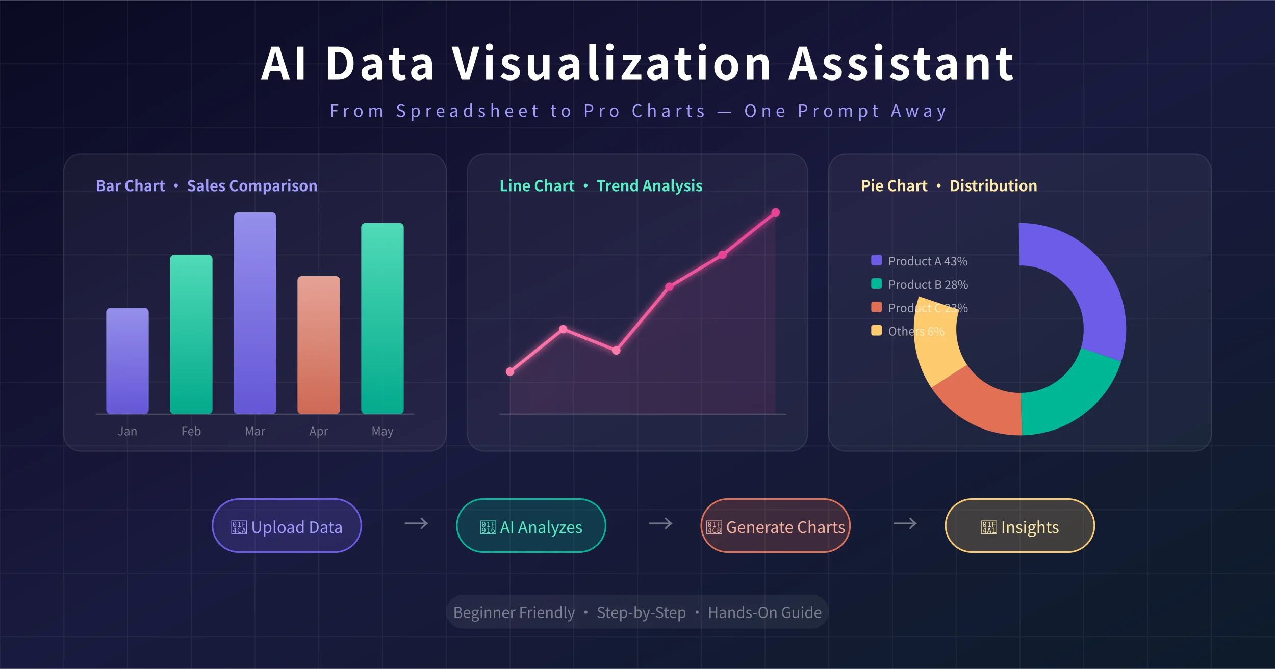
Data visualization is one of the most common—and most frustrating—needs in the workplace. The good news is: AI can generate professional charts for you with just one sentence.
Today's article teaches you how to use AI tools to turn table data from Excel, CSV, and other sources into beautiful charts—bar charts, line charts, pie charts, dashboards—all handled. You can learn it with zero foundation and start using it right after reading.
Preparation: What do you need?
Before you start, prepare two things:
- An AI tool: Recommended options include ChatGPT (GPT-4o), Claude, Kimi (Moonshot AI), and Tongyi Qianwen. These tools can all understand tabular data and generate charts.
- A dataset: An Excel (.xlsx) or CSV file, or simply copy the table data directly. The more standardized the data format, the better the result.
What kind of data works best?
AI excels at visualizing structured data—that is, tables with clear rows and columns and headers. For example:
- Sales data (month, product, revenue)
- User data (date, new users, active users)
- Financial data (account, amount, percentage)
- Survey data (option, number of respondents, percentage)
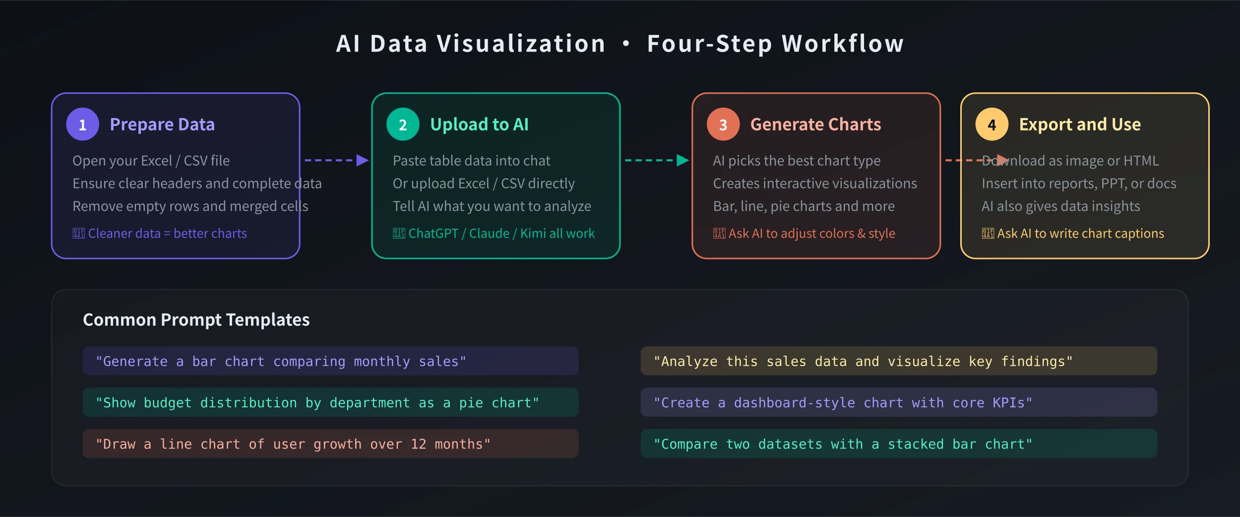
Step 1: Prepare your data
Whether your data is in Excel, Google Sheets, or elsewhere, first organize it into a standardized table format:
- The first row must be headers: Each column name should be clear, e.g., "Month", "Revenue", "Growth Rate".
- Avoid merged cells: AI cannot read merged cells, which leads to data parsing errors.
- Remove blank rows and columns: Keep the data area continuous without empty rows in between.
- Use numeric format for values: Don't write 1000 as "one thousand" or "1,000 yuan"; use 1000 directly.
Sample data
Suppose you have this sales data:
Month | Revenue (10k) | Month-over-month growth
Jan | 85 | —
Feb | 92 | 8.2%
Mar | 78 | -15.2%
Apr | 105 | 34.6%
May | 118 | 12.4%
Jun | 132 | 11.9%
This format is perfect and can be handed directly to the AI.
Step 2: Give the data to the AI
There are three ways to provide data to the AI:
Method 1: Paste text directly
Select the table data → Copy → Paste into the AI dialog. This is the simplest method, suitable for small datasets (a few dozen rows or less).
Method 2: Upload a file
Click the upload button in the dialog → Select an Excel or CSV file. ChatGPT, Claude, and Kimi all support direct file uploads. Suitable for larger datasets (hundreds of rows or more).
Method 3: Screenshot recognition
If the data is on a webpage or in a printed document, you can take a screenshot and upload it to the AI, letting it recognize the table data in the image. ChatGPT-4o and Claude both support image recognition.
Step 3: Tell the AI what kind of chart you want
This is the most critical step. You need to give clear instructions to tell the AI what chart you want and what information to show.
Basic command templates
Just copy these commands and replace "data" with your own content:
Bar chart (comparing data):
"Please generate a bar chart based on the following data to compare monthly revenue. Data: [paste your data]"
Line chart (showing trends):
"Please use a line chart to show the trend of the following data, with X-axis as month and Y-axis as revenue. Data: [paste your data]"
Pie chart (showing proportions):
"Please generate a pie chart based on the following data to show the sales share of each product. Data: [paste your data]"
Combination chart (multi-dimensional analysis):
"Please generate a combination chart: use a bar chart to show monthly revenue and a line chart to show month-over-month growth. Data: [paste your data]"
Advanced command templates
Want a more professional result? Try these advanced commands:
Dashboard style:
"Please generate a dashboard-style visualization including: 1) A numeric display of total revenue; 2) A monthly trend line chart; 3) A product share pie chart; 4) Year-over-year growth rate. Use a professional color scheme."
Comparative analysis:
"Please compare this year's and last year's sales data, display them using a grouped bar chart, and annotate the growth rates."
Data interpretation:
"Please generate a chart based on the following data and provide 3–5 data insights and suggestions."
Step 4: Get the chart and export it
After the AI generates the chart, you can export it for use as follows:
ChatGPT
ChatGPT displays the chart directly in the conversation. Right-click the chart → Save image to download it as a PNG. You can also ask the AI to generate an HTML version of an interactive chart.
Claude
Charts generated by Claude are usually presented as code (e.g., Python matplotlib code). You can ask Claude to generate a runnable HTML file directly, or use the Artifacts feature to preview the chart.
Kimi
Kimi supports generating chart images directly, making it the simplest to use. Upload data → Describe your requirements → Get the chart immediately.
Use cases after export
- Insert into PPT: Drag the image directly into your presentation
- Add to reports: Paste it into a Word document
- Send via email: Attach the image or embed it in the email body
- Publish to WeChat Official Account: Upload the image directly
Practical case: Creating a complete data report with AI
Below, we use a complete example to demonstrate how to create a data visualization report from scratch.
Scenario: Quarterly sales analysis report
You have Q2 sales data and need to create a visual report for your boss.
Step 1: Organize the data, ensuring the format is standardized.
Step 2: Upload the data to the AI and input the command:
"I have Q2 2026 sales data (see attachment). Please help me:
1. Generate a monthly sales trend line chart
2. Generate a product line sales share pie chart
3. Generate a regional sales comparison bar chart
4. Provide 5 data insights and suggestions
5. Use a unified color scheme for all charts, with a clean and professional style"
Step 3: The AI will generate all charts and analysis reports at once. You only need to fine-tune the details and then export for use.
The entire process takes less than 10 minutes, whereas the traditional method might take half a day.
Common issues and solutions
What if the AI-generated chart colors look bad?
Simply tell the AI the color style you want. For example: "Please use a blue color scheme" or "Refer to Apple's minimalist style." You can also specify exact color codes.
What if the dataset is too large for the AI to handle?
First do a preliminary summary in Excel (e.g., aggregate by month), then hand the summarized data to the AI. Alternatively, only select the key data columns and remove unnecessary information.
What if the AI generates the wrong chart type?
Clearly tell the AI what chart type you want. For example: "I need a stacked bar chart, not a grouped bar chart." The AI will adjust based on your feedback.
How can I make the charts look more professional?
Try these commands: add data labels, add trend lines, use gradient colors, include a legend, and annotate key data points.
Recommended AI visualization tool comparison
ChatGPT (GPT-4o): Most versatile, supports a wide range of chart types, and interactive charts work well. Suitable for most scenarios.
Claude: Excellent code generation capability, ideal for highly customized charts. The generated Python code can be run directly.
Kimi (Moonshot AI): Best Chinese language understanding, simplest to operate. Suitable for quickly generating charts without any technical background.
Tongyi Qianwen: Developed by Alibaba, with strong support for Chinese data and domestic scenarios. Suitable for handling Chinese reports.
Wenxin Yiyan: Developed by Baidu, with fast chart generation. Suitable for quick previews and simple chart needs.
Summary
Data visualization is no longer exclusive to designers and programmers. With AI, anyone can generate professional charts with just one sentence.
Remember this workflow: Organize data → Upload to AI → Describe your needs with clear instructions → Export and use.
Next time you need to create a chart, stop manually toiling away. Give AI a try. Get done in 10 minutes what used to take half a day—that's efficiency.
📖 Related Articles
AI Account Security and Password Manager Guide: Password Generation, Breach Detection, and Privacy Protection Made Easy
Learn how to use AI tools to manage account security: generate strong passwords, detect password weaknesses, check for data breaches, and interpret privacy policies. Zero to hero in 10 minutes.
TutorialsAI Academic Writing Assistant Practical Guide: Paper Polishing, Literature Review, and Formatting All in One
A practical guide to AI academic writing assistants: paper polishing, literature review, and formatting all in one—a complete tutorial on AI-assisted writing for graduate students and academic researchers.
AI Email Writing Assistant Guide: Business Emails, Follow-ups & Reply Templates Made Easy
Step-by-step guide to writing high-quality emails with AI: business negotiation, follow-ups, polite refusals, job applications — generate a professional email in 30 seconds, no experience needed.
💬 Comments are not yet available, stay tuned